Lexis diagrams (cont.)
Unfortunately, translating period data to cohort data in this way does not give us a real cohort in the strictest sense.
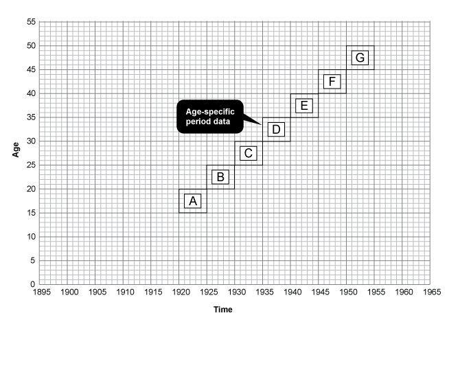
It is easiest to understand why this is by looking at the same data depicted on a Lexis diagram.
The black boxes represent the age-specific data highlighted in pink on the previous table. Theoretically they should represent a cohort. However if we add in true birth cohorts, we can see how they do not directly correspond.
![]() Click the arrows to see the birth cohorts which fall within these boxes.
Click the arrows to see the birth cohorts which fall within these boxes.