The Total Fertility Rate (cont.)
Cohort Fertility (cont.)
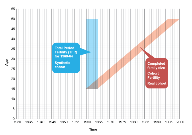
Lexis diagram 1
The Lexis diagram is a useful type of graph that helps to identify the constituents of cohorts. Typically having a y-axis of age and an x-axis of calendar period – both drawn to the same scale – cohorts can be shown as blocks moving at a 45° angle whereas period measures sit as a column in the selected period. Seemingly simple and obvious the Lexis is surprisingly helpful in identifying cohorts for mortality or fertility analysis.
The diagram below shows graphically the difference between the age-time constituent of the period TFR for 1960-64 and the constituent for the Cohort TFR for those entering their reproductive years in 1960-64.
![]() Click on the arrows underneath the Lexis diagram to see the difference between a period and a cohort approach.
Click on the arrows underneath the Lexis diagram to see the difference between a period and a cohort approach.