Parity Progression Ratios (cont.)
Going further (cont.)
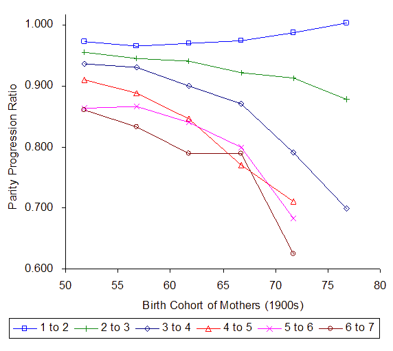
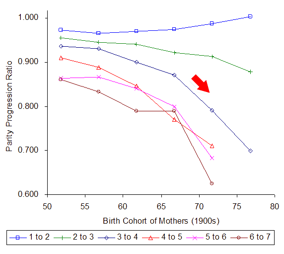
The following example shows projected PPRs calculated from a survey of Iraq in 1999 where full birth histories were taken. Note the steep drop in a3 – the ratio of mothers with 3rd births going on to have a 4th birth - by the younger mothers.
Figure 8: Projected PPRs by Birth Cohorts for two areas of Iraq - 1999 survey
Push button for interpretation
In this figure each line is a time series of a particular PPR. The x axis represents older or younger cohorts – so moving from left to right on the figure illustrates younger cohorts of women and therefore more recent estimates.
The uppermost series is that of a1. a0 is not there but presumably that would be fairly flat with consistently high proportions of women becoming mothers – this is normal. a1 is actually rising – more women are having second children. This could possibly be because primary or secondary sterility is declining.
a2 is declining with time but there are still high proportions for all cohorts.
The interesting line is a3 (dark blue). Over the first four time points there has been a decline in the proportions moving from three children to four but the proportions are still high at about 90%+. But in the last 10 years of these series the a3 proportion plummeted to only 70% (see arrow on graph).
Higher PPRs also declined rapidly. However it is the rapid and sudden decline of a3 that suggests that younger mothers are making a positive decision to limit their family.