Life tables (cont.)
Graphing the lx column
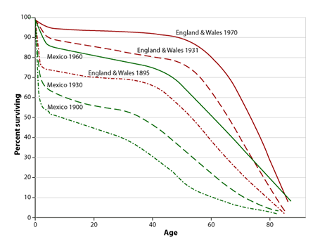
Figure 1: Survival curves for Mexico and England & Wales
Source: LSHTM
For comparing between nations or provinces, regions etc. it is often useful to graph the lx column.
Figure 1 shows graphs of six different lx columns, three from different historical periods for England and Wales (E&W), three from roughly equivalent historical periods for Mexico. The lower the line the higher is mortality. What you can see is that mortality has improved over time for Mexico and for E&W. However, in each time period mortality is lower in E&W than it is in Mexico.
![]() Study this graph carefully. Decide which is the single aspect of the mortality curves that accounts for the majority of the differences between them.
Study this graph carefully. Decide which is the single aspect of the mortality curves that accounts for the majority of the differences between them.
The biggest variation between the curves lies in the first 5 years i.e. under-5 mortality. If mortality at this life-stage was similar the curves would be very much closer together.
![]() Think of other important points of interpretation in this graph and jot them down before clicking the 'Feedback' button.
Think of other important points of interpretation in this graph and jot them down before clicking the 'Feedback' button.
- Mortality improves over time in both countries, but at comparable times England and Wales always has lower mortality overall.
- You can see that the curve of lowest mortality it is quite flat between ages 5 and 50 whereas in the highest mortality situation the lx curve is losing people at a steady rate throughout adult ages. This is a common pattern linked to levels of mortality.
- At adult ages the point at which mortality starts to accelerate (gets worse) is at about age 55 in the low mortality curve and this inflection starts progressively earlier in higher mortality situations.
- The very large increase in proportions alive at age 80, in both countries, between 1930 and 1960/70.
Note: Most life table columns can be graphed and a selection is presented in the next session; Life Tables II