Relational model life tables (cont.)
If any two lx columns are logit-transformed and then plotted together they do form a tolerably straight line. Let's take an example:
| Age x | CD West 30 | UN LA 60 | ||||
|---|---|---|---|---|---|---|
| 100000 | lx propn. | Yx logit lx |
100000 | lx propn. | Yx logit lx |
|
| 5 | 61196 | 0.6120 | -0.2278 | 85881 | 0.8588 | -0.9027 |
| 10 | 58141 | 0.5814 | -0.1643 | 84901 | 0.8490 | -0.8634 |
| 15 | 55864 | 0.5586 | -0.1178 | 84480 | 0.8448 | -0.8472 |
| 20 | 53002 | 0.5300 | -0.0601 | 83900 | 0.8390 | -0.8254 |
| 25 | 49614 | 0.4961 | 0.0077 | 83204 | 0.8320 | -0.8001 |
| 30 | 46072 | 0.4607 | 0.0787 | 82423 | 0.8242 | -0.7727 |
| 35 | 42361 | 0.4236 | 0.1540 | 81472 | 0.8147 | -0.7405 |
| 40 | 38624 | 0.3862 | 0.2316 | 80293 | 0.8029 | -0.7024 |
| 45 | 34968 | 0.3497 | 0.3102 | 78743 | 0.7874 | -0.6548 |
| 50 | 31396 | 0.3140 | 0.3908 | 76609 | 0.7661 | -0.5932 |
| 55 | 27280 | 0.2728 | 0.4902 | 73294 | 0.7329 | -0.5048 |
| 60 | 22764 | 0.2276 | 0.6109 | 68218 | 0.6822 | -0.3819 |
| 65 | 17384 | 0.1738 | 0.7793 | 60627 | 0.6063 | -0.2158 |
| 70 | 12025 | 0.1202 | 0.9951 | 50383 | 0.5038 | -0.0077 |
| 75 | 6931 | 0.0693 | 1.2987 | 37619 | 0.3762 | 0.2529 |
| 80 | 3073 | 0.0307 | 1.7256 | 23960 | 0.2396 | 0.5774 |
| 85 | 937 | 0.0094 | 2.3302 | 12350 | 0.1235 | 0.9799 |
The table above shows the lx column of two different mortality patterns – the CD West pattern at e0=30yrs and the UN Latin American pattern at e0=60yrs.
The columns have been transformed firstly to proportions and then to logits. Note how the logit value changes from negative to positive as the lx proportion drops below 0.5.
Click to reveal a relational plot of these two patterns
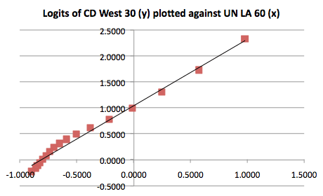
A trendline has been fitted. The "tolerably straight" line is apparent although it is clear that there is a distinct lack of linearity on the extreme left of the graph. The reason for this departure from linearity is that we have purposely chosen two very different mortality patterns to compare and so, in effect, we are pushing the linear relationship to its limits - but even so the relationship is quite good.