Introduction (cont.)
Exercise (cont.)
Question 5
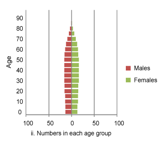
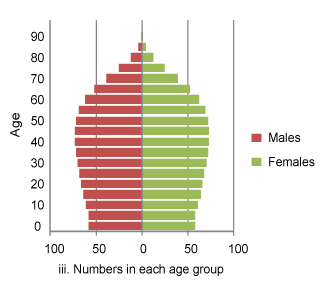
Graph i is the graph showing the proportions in each age group as on the previous page. Graphs ii and iii show what this population would look like at different points in time (0 years or 100 years). In the drop-down box choose which time-point each graph represents.
![]() Attach the correct labels to show which years the number graphs illustrate.
Attach the correct labels to show which years the number graphs illustrate.

 |
|
Incorrect, sorry. This is a shrinking population, so the smaller population corresponds to the later year. Yes, that’s right! This is a shrinking population, so the smaller population corresponds to the later year. |
 |
|
Correct, well done! This is a shrinking population, so the smaller population corresponds to the later year. Not correct, sorry. This is a shrinking population, so the smaller population corresponds to the later year. |